
Chosen Infographic
I decided to use this infographic specifically because, as I do an assignment to enhance my knowledge of infographics, I thought “Why not choose an infographic that helps me understand infographics better?” And, here we are. There are several aspects of this infographic by Dustin Stout that I wish to highlight: Its organization, color choices, and simplicity.
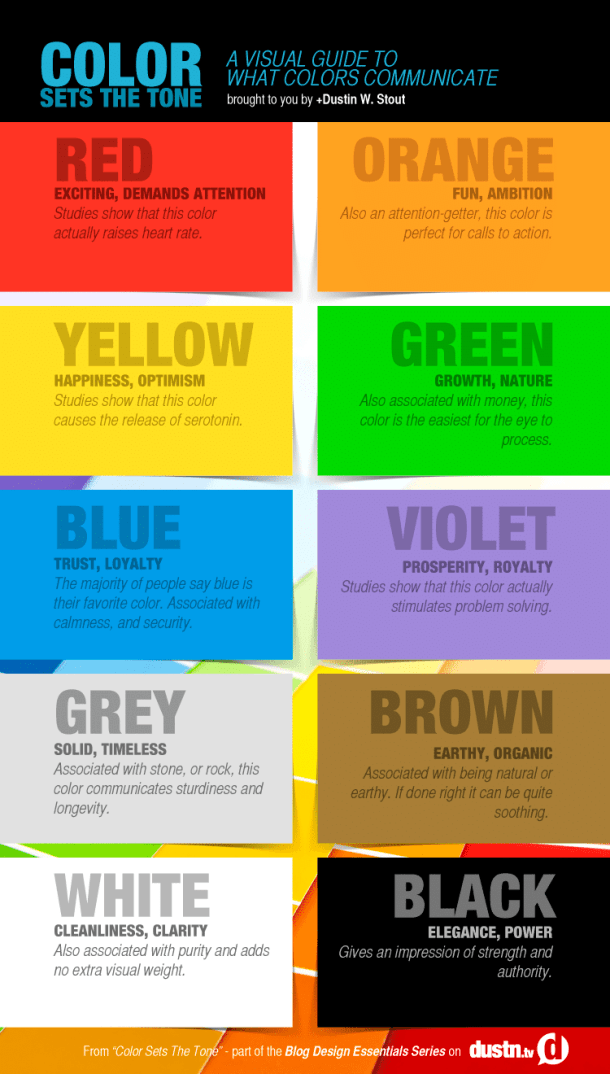
Organization Aspects
Balance
This infographic uses a formal balance in which each color box is symmetrically aligned and equally separated. This form of balance gives the infographic’s information a steady, smooth, and equal emphasis; there is not one color given more space or information, showcasing that each color is important for a specific purpose, therefore this balance symbolizes a lack of emphasis to any specific color.
Consistency
Additionally, this infographic is effectively consistent in terms of a large font line with the specific color, followed by a bold depiction of what the color symbolizes, then lastly supported with italicized additional information that may be useful when using the color.
Color Order
The specific color order in this infographic is ROYGBIV + Neutrals, or the colors of the rainbow (Red, orange, yellow, green, blue, and violet) followed by the neutral colors (grey, brown, white, and black) which is an intentional choice of organization that many of the audience already know. Furthermore, Stout pairs black and white together which is an effective choice because those colors have a strong association in many symbols of balance, such as the Yin/Yang symbol used in Taoist philosophy:

Color Choices
Background/Foreground Balance
Stout uses color in the background effectively to balance out his infographic. As the colors of the rainbow are being described, the background consists of white space. However, as the colors being described are neutral, the background contains color, another rainbow pattern, to further give balance to the infographic for the audience.
Stout’s Introduction
Using Stout’s infographic to analyze color, it can be seen that Stout specifically chooses black and blue in a way to specifically show trust and loyalty with blue, and elegance and power with the black background. The choice in introduction creates a nice transition from introduction to the information in the infographic due to the black to white background shift.
One further note is that black is used in the heading of the infographic, and the last color to be described is black, giving a nice color introduction and conclusion to the information provided by Stout.
Simplicity
No Chartjunk
One last note is that there is no chart junk in this infographic; there are ten separate colors with different associated meanings, so there is a significant amount of information provided that is not hindered by any additional symbols, images, or other decorative elements.
